Email Marketing Dashboard & Reporting: How to Measure What Actually Matters for Shopify
Open rates feel like progress. They tell you nothing. This is the dashboard that replaces vanity metrics with the six numbers that actually decide whether your email program is making money — plus a template you can build in an hour.
Most email dashboards lie. Not deliberately — by omission. They show open rates that iOS has made meaningless, click rates without context, and a subscriber count that grew last month but doesn’t reveal that 40% of those subscribers are already disengaged. None of it answers the only question that matters: is email making us money, and where is the next dollar coming from?
This is the dashboard that does. Six metrics, structured so every number on the screen drives a decision. We use this exact framework with our Shopify clients, and we’ll walk you through how to build it for your store.
1. Why Most Email Dashboards Show the Wrong Things
The default Klaviyo dashboard — like most ESP dashboards — leads with what’s easy to display, not what’s worth knowing. Open rate, click rate, subscriber count. Three numbers that go up and to the right while revenue stays flat, and nobody notices the contradiction.
The problem isn’t that these metrics are useless. It’s that they answer the wrong question. Open rate tells you whether subject lines worked; it doesn’t tell you whether the email earned anything. Click rate tells you what percentage of people interacted; it doesn’t tell you whether they bought. Subscriber count tells you how many emails you can send; it doesn’t tell you whether the list is healthy or quietly rotting.
A good dashboard answers three questions, in this order: how much did email earn this period, where did the revenue come from (and where didn’t it), and what’s the leading indicator that next period will be better or worse. Everything else is noise.
2. The Six Metrics That Belong on Every Shopify Email Dashboard
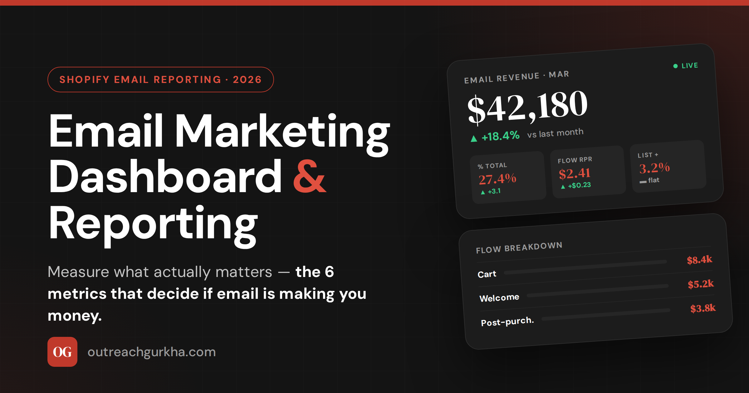
These are the six numbers we put on every client dashboard, in priority order. Each one drives a specific decision.
| Metric | What it tells you | Healthy range |
|---|---|---|
| 1. Revenue per email sent (RPR) | The single most important number. Total revenue ÷ total emails sent. Campaign RPR and flow RPR reported separately. | Campaigns: $0.10–$0.30 · Flows: $1.50–$3.00 |
| 2. Email-attributed revenue (% of total) | Email’s share of total Shopify revenue. The channel’s contribution at a glance. | 20% acceptable · 30–40% strong |
| 3. List growth rate | Net monthly change — sign-ups minus unsubscribes and cleanings. Not size; rate. | 2–5% per month |
| 4. Flow performance (per-flow revenue) | Revenue + RPR for each automated flow individually. Where to find the broken link. | Cart flow: $3–$5 RPR top quartile |
| 5. Campaign vs flow revenue split | How email revenue divides between scheduled campaigns and automations. | 30–50% from flows is balanced |
| 6. Deliverability health score | Composite: bounce rate, spam complaint rate, sender reputation, inbox placement. | Bounce <1% · Complaints <0.1% |
A note on RPR. Revenue per recipient is the single most important email metric and almost no Shopify store reports it. It collapses opens, clicks, conversions, AOV, and frequency into one honest number: how much did the average email earn? If that number is rising, the program is improving. If it’s falling, something specific is breaking. No other metric gives you that signal as cleanly.
The campaign vs flow split is the diagnostic that surfaces the biggest hidden problems. If flows are under 30% of email revenue, your automated foundation isn’t built — which means you’re working hard on campaigns to compensate for revenue your flows should be generating in the background. If flows are over 70%, you’re not running enough campaigns and the list is getting bored.
3. How to Build a Simple Email Marketing Report
The report itself doesn’t need to be complicated. A spreadsheet, a Notion page, a Klaviyo dashboard — the format matters less than the structure. Here’s the structure that works.
The structure is what matters. Six metric cards on top — the leading indicators. A flow breakdown beneath them — the diagnostic layer. And a third section (not shown above) for the period’s campaigns: sends, revenue, RPR, and a one-line note on what each campaign was testing or learning.
Weekly view is operational — what to ship or fix this week. Watch campaign RPR, the previous send’s performance, deliverability for any sudden change. Monthly view is strategic — total revenue, % of total, flow trends over time, list growth direction. Run both views, but report monthly. Decisions made on a single week of data are usually wrong.
4. Goal-Setting Framework: How to Set Realistic Email Goals
“Increase open rate by 10%” is not a goal. It’s a wish about a metric that doesn’t decide anything. Real email goals are tied to revenue, set against your current baseline, and bounded by a deadline.
The framework: start with your current numbers, choose one or two metrics that materially move revenue, set a target three months out, and translate the target into a dollar figure so the goal connects to the business.
A worked example: Your store does $120K/month total, and email currently drives 18% ($21.6K). Cart-flow RPR is $1.90 — below the $3+ benchmark. Goal: lift email’s share from 18% to 25% in 90 days, primarily by rebuilding the cart flow to a $3.50+ RPR. Translated: that’s roughly $30K/month from email vs $21.6K today — an extra $8K/month, or $96K annualized. Now the goal has a number the founder cares about, and a specific lever to pull.
The mistake to avoid: chasing every metric simultaneously. Pick the one or two that have the most leverage for your store this quarter — usually flow RPR if flows are weak, or campaign frequency if you’re under-sending — and ignore the rest until those move. A dashboard with twelve goals has zero priorities.
5. Klaviyo Reporting: How to Pull the Right Data
If you’re on Klaviyo, the six metrics above are all available — they’re just not on the default screen. Here’s where to find them.
→
→
→
→
→
The trap most stores fall into: relying on Klaviyo’s default “Performance Over Time” charts, which lead with opens. Build a saved view that surfaces revenue, RPR, and the flow/campaign split first. Open the dashboard once a week, the same view every time, and the trends become impossible to miss.
6. How Outreach Gurkha Reports to Clients
We bill on performance, which means our reporting has to be defensible to the dollar. Here’s what every client gets at the end of every month — and you can copy the format directly.
What goes in the report
- Email revenue this month, in dollars
- % of total Shopify revenue (the channel’s share)
- Flow breakdown — revenue + RPR per flow
- Campaign log — every send, revenue, RPR, learning
- List health — growth rate, deliverability flags
- Next month’s plan — what we’ll build/test
What deliberately doesn’t go in
- Open rate as a primary metric
- Subscriber count as a vanity number
- “Engagement” without revenue context
- Charts that show direction but no decision
- Anything we can’t tie back to revenue
- Caveats or jargon. Plain numbers, plain English.
Plus a 10-minute Loom walking through the dashboard live — what changed, why, and what we’re doing about it. Reading numbers is faster than reading paragraphs about numbers, and a Loom adds the context a table can’t carry. The whole report takes about 90 minutes to produce because the dashboard is built once and refreshed monthly — not rebuilt every cycle.
Email Reporting Quick Reference — 2026
Built for your store, not a template
Want a Custom Dashboard Built for Your Store? Let’s Talk
We’ll build the dashboard above for your Shopify store, configured to your numbers, your flows, and your goals — then maintain it monthly as part of the program. You see exactly what email is earning and where the next dollar is hiding.
No retainer. No setup fee. We charge 10% of the email revenue we generate — after it lands in your Shopify account.
Custom dashboard built in Week 1.
Monthly report + Loom walkthrough.
For Shopify stores doing $10K–$150K/month.