Shopify Email Swipe File — 2026
Email Marketing Inspiration: 12 Real Ecommerce Email Examples That Convert (With Breakdowns)
Not 12 emails to admire. 12 patterns to steal. Each one broken down — the subject line, the design choice, the copy mechanic — so you can run it in your own store this week.
By Outreach Gurkha
Updated 2026
Read time 14 min
For Shopify owners who need fresh email ideas
A swipe file is more useful than a single great email. Looking at one brilliant campaign teaches you that the campaign was brilliant. Looking at twelve, across different categories, teaches you the patterns underneath — the subject-line moves, the design choices, the one CTA discipline — that make any of them work.
That’s what this guide is. Twelve email patterns drawn from what consistently converts on Shopify in 2026, each with the mechanic spelled out and a single takeaway you can apply. Skim it, or steal one a week.
1. What Makes a Great Ecommerce Email
Before the examples, the four things every high-converting email does — regardless of category. Every example below uses all four; you’ll see the pattern repeat.
| Element |
What “great” looks like |
| Subject line |
Under 50 characters. One specific promise or curiosity hook. Reads like a friend texted, not a brand emailed. |
| Design |
Mobile-first. One hero image. Clear visual hierarchy. Looks intentional in 3 seconds. |
| CTA |
One button. One action. Repeated 1–2 times. The whole email exists to drive this single click. |
| Personalization |
Not “Hi {first_name}.” Real personalization — the product they viewed, the size they bought, the segment they belong to. |
The principle underneath all four: one email, one job, one CTA. Every example below earns its conversion by ignoring the temptation to ask for three things at once.
2. The 12 Email Examples (With Breakdowns)
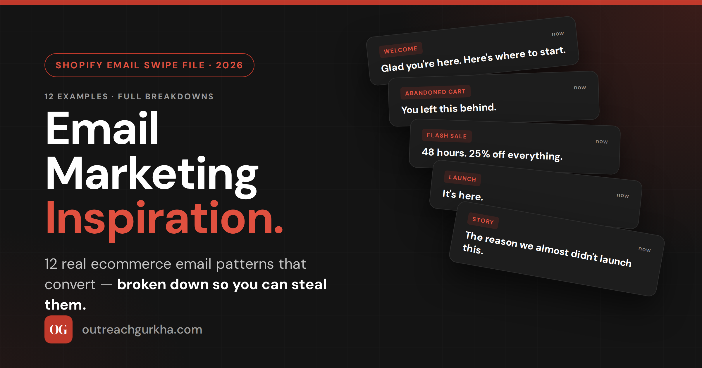
WelcomeExample 01
Subject
“Glad you’re here. Here’s where to start.”
Why it works: The subject reads like an actual welcome rather than a transaction. No discount in the line — that’s saved for inside, which raises curiosity. The email opens with one warm sentence, then immediately gives the reader something useful: a 3-product “start here” guide based on bestsellers, not a wall of catalog. One CTA: “See the lineup.” Sender name is a person, not “Marketing Team.”
Steal this: Lead with usefulness, not urgency. New subscribers are at peak trust — don’t burn it asking for a sale in email one.
Welcome · DiscountExample 02
Subject
“Your 15% off — and the reason it exists.”
Why it works: Most discount welcomes lead with the percentage. This one leads with curiosity. Inside, the discount is delivered after a two-sentence story about why the brand offers one (gratitude for the signup, not a desperate hook). That framing dramatically lifts redemption because the discount feels earned, not generic. Code is shown twice and the CTA is “Use my 15% off →,” written from the subscriber’s perspective.
Steal this: Frame the discount as a gift with a reason. Generic “15% off” codes redeem far worse than codes attached to a one-line story.
Abandoned CartExample 03
Subject
“You left this behind.”
Why it works: Four words. Zero brand voice. Reads like a human message, which is exactly the disarming effect a cart email needs. The email shows the exact item left behind (image + name + price), one supporting line of social proof (“4.8★ from 1,247 reviews”), and a single “Return to your cart” button. No discount in the first send — that’s reserved for the second touch 24 hours later, so you don’t train people to abandon for the code.
Steal this: Never lead a cart sequence with a discount. Hold the offer for touch two. The first email recovers intent; the second recovers price objections.
Abandoned Cart · UrgencyExample 04
Subject
“Your cart expires in 2 hours.”
Why it works: The third cart-sequence email when nothing else has landed. Specific time window creates real urgency (not “soon” — two hours). The body is one image, one sentence — “We’ve held your cart, but it’s about to release.” — and the button. The urgency is genuine because the cart literally does expire from the system, which keeps the email honest. RPR on this third touch routinely hits $3+ for stores running it.
Steal this: Specific beats vague. “2 hours” outperforms “soon” by a wide margin because the brain can act on a deadline it can picture.
Flash SaleExample 05
Subject
“48 hours. 25% off everything.”
Why it works: Total economy. Subject delivers the offer, deadline, and scope in seven words. Inside: a hero banner with the discount, a 3-product grid of bestsellers (not the full catalog), a single CTA, and the deadline repeated in the footer. No story, no setup. Flash sales work when the urgency does the persuasion; copy should get out of the way. Email length is under 100 words.
Steal this: Flash-sale emails should be the shortest emails you send. Every extra sentence dilutes the urgency. Subject → image → button → deadline. Nothing else.
Product LaunchExample 06
Why it works: Two-word subject only works if the list is warmed — and that’s the point. This is the third send in a launch campaign; the first two were teasers (“something’s coming”) that built anticipation, so by the time “It’s here” lands, subscribers know what “it” is and want to click. The email itself is one hero shot of the product, three sentences on what makes it different, and a button. Confidence in the subject signals confidence in the product.
Steal this: The shortest launch subjects only work after a warm-up. Send 2 teaser emails first; then “It’s here” detonates.
StorytellingExample 07
Subject
“The reason we almost didn’t launch this.”
Why it works: Curiosity-gap subject — the reader has to open to find out. Inside: a 400-word founder note about a near-failure during product development, ending with what the team learned and why the product is better for it. The story does the selling; the product link appears once, at the end. These emails post some of the highest engagement rates of any send type because they don’t feel like marketing.
Steal this: Vulnerability sells. A story about what went wrong builds more trust than a story about how great you are. Save the latter for the website.
Founder NoteExample 08
Subject
“Quick note from [Founder name]”
Why it works: Plain text. No images. No header design. Looks like the founder typed it from their phone — and that’s the design choice. The format signals personal communication, which lifts open and reply rates dramatically. Used for milestone announcements, product changes, or thank-you notes after big launches. The “reply if you have thoughts” line at the end actually generates replies, which Gmail reads as positive engagement signal.
Steal this: Once a quarter, send a plain-text founder email. The lift in deliverability and goodwill outlasts the email itself.
Post-Purchase · EducationExample 09
Subject
“How to get the most from your “
Why it works: Lands 3 days after delivery — the moment the customer first uses the product. The email is purely educational: 3 tips, a how-to image or short GIF, and a link to a deeper guide. No sell, no cross-sell. The implicit pitch is “we care if you get results,” which sets up the cross-sell email two weeks later. This sequence is what turns one-time buyers into repeat customers.
Steal this: Your highest-LTV emails aren’t promotional. They’re the post-purchase education sends that make the customer better at using what they bought.
Re-EngagementExample 10
Subject
“Have we lost you?”
Why it works: Direct, slightly vulnerable, hard to ignore. Sent to subscribers who haven’t opened in 90 days. The email asks one question — “Want to stay on the list?” — with two buttons: “Yes, keep me in” and “No, take me off.” The opt-out option is the point; subscribers who don’t engage get suppressed automatically, which protects deliverability. The brands that win at email aren’t afraid to shrink their list.
Steal this: Quarterly re-engagement campaigns are the cleanest deliverability tool you have. Let dormant subscribers leave; the ones who stay are gold.
Back-in-StockExample 11
Subject
“It’s back. (And probably won’t be for long.)”
Why it works: Triggered the moment a subscriber’s waitlisted product is restocked. Highest-intent email a store sends — the recipient literally raised their hand. The subject combines the news with genuine scarcity (the product sold out once already), which creates immediate FOMO. Inside: one image, “We have it back,” the size/variant they wanted, and a button. These emails routinely convert 20%+ because the recipient already wanted it.
Steal this: Back-in-stock is the highest-converting flow most stores don’t have set up. Add it before any campaign optimization.
Value NewsletterExample 12
Subject
“5 things we’re loving this week”
Why it works: Format reads as a curation, not a promotion — even when products are included. The “5 things” can be one new arrival, one customer story, one tip, one bestseller, and one off-brand recommendation (a book, a song, a tool). The off-brand item is the trust-builder; it signals you’re not just selling. Subscribers come to expect and look forward to the format, which is what newsletters should aim for.
Steal this: Mix something un-sellable into every newsletter. A book recommendation, a playlist, a thought. It makes everything else feel less like marketing.
3. How to Use Graphics, Banners, and GIFs Without Hurting Deliverability
The fastest way to land in spam is to send a beautifully-designed email that’s 95% image. Spam filters read image-heavy emails the way they read blank ones — as suspicious. Here’s the discipline that keeps design rich and inboxing strong.
The 60/40 rule: Aim for roughly 60% text to 40% image by volume. Live HTML text (not text inside images) gives filters the content they need to score the email correctly, ensures readability when images are blocked, and protects you from looking broken in dark mode.
A few specific guardrails: alt text on every image — both for accessibility and so the email still communicates when images don’t load. Keep total email weight under 100KB to avoid Gmail clipping (the dreaded “[Message clipped]”). GIFs work but use them sparingly — one per email, under 1MB, and never as the only message-carrying element. The first frame of a GIF is what shows on email clients that don’t auto-play, so design that frame as a complete message on its own.
For banners and headers: keep them simple and tall enough to look intentional on mobile, where 70%+ of opens happen in 2026. A 600px-wide, 200–300px-tall banner with one short headline overlaid on a clean image is the workhorse format. Avoid sprawling header graphics with logos, navigation, and tagline stacked — they push the actual content below the mobile fold.
4. Email Design Best Practices for Shopify
Mobile-first is the principle that overrides every other design rule. If it doesn’t work on a 380px-wide phone screen, it doesn’t work — because that’s where most of your opens happen.
→
Single-column layout. Two-column designs that look elegant on desktop become unreadable stacks on mobile. Build single-column from the start.
→
14px minimum body font. Anything smaller forces the reader to pinch-zoom, which is friction. Headlines 22–28px on mobile.
→
CTA above the fold. The first button should appear in the first 600px of the email. A second CTA can repeat later. Never bury the primary action.
→
Buttons, not text links. Tappable area minimum 44×44px (Apple’s standard). Bulletproof HTML buttons render in clients that strip CSS — image-buttons break.
→
Dark mode tested. Logos with transparent backgrounds and dark text invert badly. Test every template in dark mode before shipping.
5. How to Develop Your Own Brand Voice in Email
Brand voice is the thing that makes a subscriber recognize an email is from you before they see the logo. It’s also the most-skipped step in email programs, because it’s harder than picking a font.
Start with one constraint: write the way you’d actually speak if you were talking to a customer at the counter. Read every draft aloud — if it sounds like a press release, rewrite it. The clearest test: would you actually say this sentence to a real person, or only write it in a marketing email? If only the latter, cut it.
A practical voice-development exercise: Write down three brands whose emails you actually enjoy reading. For each, identify one specific thing about their voice — a sentence rhythm, a word choice, a willingness to be funny or vulnerable. Then write your next email trying to do that one thing in your own way. Repeat across five emails. By send six, your voice will start to emerge as a remix that’s distinctively yours. Voice is built in iterations, not declared in a brand guide.
Three voice principles that work across categories: be specific over general (“we shipped 847 orders last week” beats “we ship lots of orders”), be one person, not a committee (“I” is stronger than “we,” and “we” is stronger than “the team”), and use the words your customers use, not the words marketers use. If your customers call it a “thingy,” your email should call it a thingy.
Email Inspiration Quick Reference — 2026
1
Every high-converting email does four things: subject line under 50 chars with one promise; mobile-first single-column design; one CTA repeated 1–2 times; real personalization (not just first name).
2
The 12 patterns above span welcome, cart, flash sale, launch, story, founder note, post-purchase, re-engagement, back-in-stock, and value newsletter. Use them as a swipe file — one per week.
3
Design without hurting deliverability: 60% text / 40% image, alt text on everything, under 100KB total, GIFs sparingly with a complete first frame, banners simple and mobile-tall.
4
Shopify design rules: single column, 14px+ body, CTA above the fold, bulletproof HTML buttons (not images), test every template in dark mode before shipping.
5
Voice is built in iterations: borrow one specific element from three brands you admire, write five emails practicing it, and a distinctive remix emerges. Be specific, be one person, use customer words.
We write the emails for you
Need Emails This Good Written for Your Store?
We write, design, and ship every campaign for your Shopify store — subject lines, copy, design, automation, the full program. You see the output; we handle the swipe file behind it.
No retainer. No setup fee. We charge 10% of the email revenue we generate — after it lands in your Shopify account.
✓
Free audit delivered as a Loom in 48 hours.
✓
Copy, design, and automation — built and managed.
✓
For Shopify stores doing $10K–$150K/month.
Get a Free Email Audit →
Read next
⚡
6 Automated Email Flows That Drive Revenue on Autopilot for Shopify
Trigger, timing, and the copy framework for every flow
📅
Email Marketing Calendar: How to Plan Your Shopify Email Schedule for Maximum Revenue
Frequency, content ratio, and the 12-month seasonal map
📊
Email Marketing Dashboard & Reporting: How to Measure What Actually Matters
The 6 metrics every Shopify email dashboard needs
OG
Outreach Gurkha
Performance-only email growth engine for Shopify stores. We run your entire email channel — strategy, copy, design, automation, and reporting — and charge 10% of the revenue we generate. Based in Kathmandu. Focused entirely on your revenue.